Mephoria
Identity for a South African demi-fine jewellery brand, founded and handmade by Mari Du Plessis. The name means me + euphoria: joy you can wear.
- Sector
- Jewellery
- My part
- Identity, wordmark & brand system
- Inside
- Brand book, logo artwork and generated imagery direction; pre-launch brand

Give a new, handmade jewellery brand a distinctive identity around personal choice and everyday joy. Mephoria’s name combines me + euphoria; the visual system needed to make that feeling recognisable.
Start with the name: a custom flared wordmark with a butterfly embedded in its flourishes. Extend that silhouette into a glowing primary lockup, a clean submark and an M monogram, then use strong colour pairings to let the same identity shift mood.
me + euphoria.
Mephoria began with Mari, a maker who believes jewellery should make you feel something. The name is the promise: a personal, wearable dose of joy.
Always becoming, never finished.
Let the nametake flight.
A custom flared wordmark gives the name its edge. Set across a glowing butterfly, it becomes the brand’s signature, and the butterfly carries the rest: always becoming, never finished.
One silhouette, from a glowing hero to a monogram.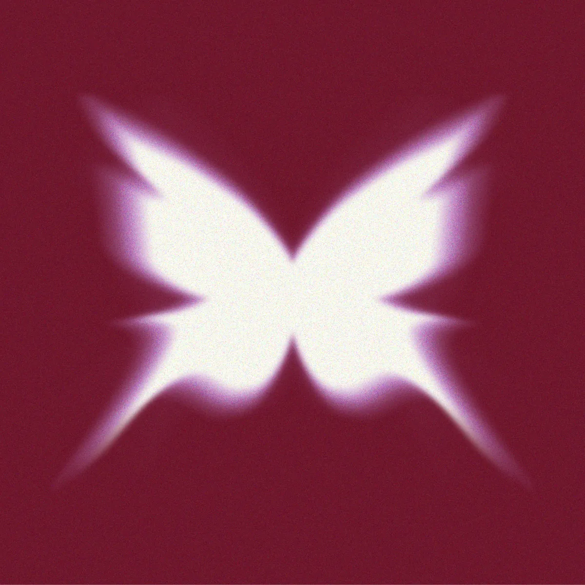
What Mephoria is built on.
A single belief: joy is something you can wear. Every piece is a build-your-own dose of euphoria, your story and your stack, chosen for yourself, no occasion required.
Joy, first
Every piece is a small hit of euphoria. If it doesn’t spark joy, it doesn’t ship.
Personal by design
Build-your-own means she wears her story, not ours.
The human hand
Made by a real maker, in South Africa: never mass-produced, never machine-made.
Warm, not cool
Inclusive and emotional, never aloof. Warm beats poised, every time.
Honest luxury
Demi-fine quality … a premium feeling, an accessible reality.
Core values / Mephoria brand book, July 2026
A wordmark that becomes a butterfly.
A custom flared serif forms the body of a glowing, motion-blurred butterfly: the brand’s transformation-and-euphoria story in a single mark.
The wordmark
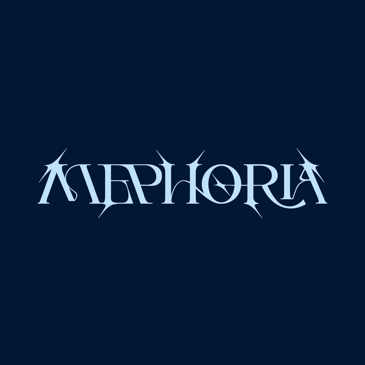
Bespoke letterforms.
A flared display serif drawn from scratch: never a font you can install.
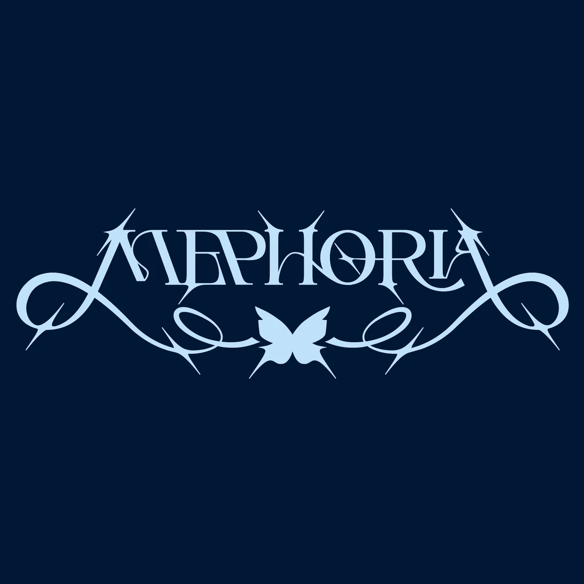
Flourishes added.
Calligraphic flourishes either side, and a tiny butterfly at the bridge.
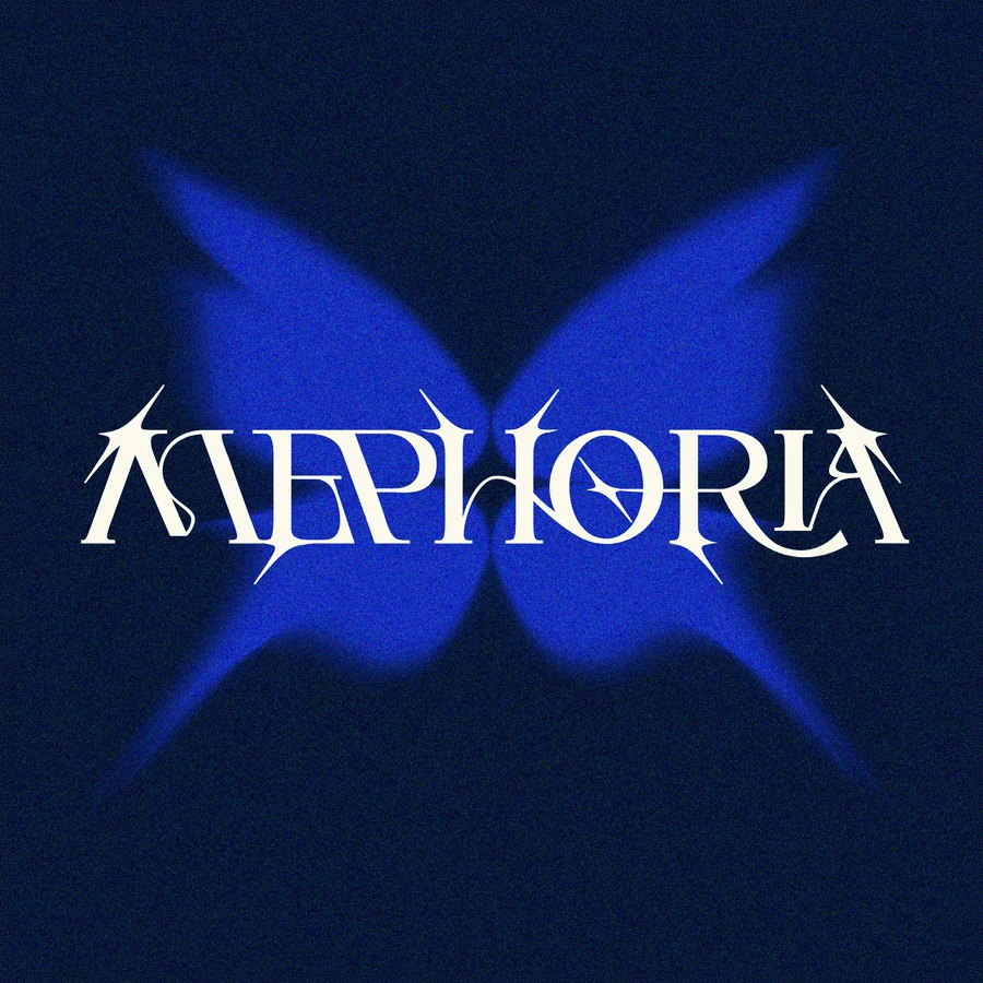
The butterfly takes flight.
A motion-blurred butterfly composes itself around the wordmark.
The butterfly

The skeleton.
A flat, symmetric butterfly: the submark, the favicon, the small-size icon.

Motion blurs the edges.
The clean silhouette becomes a creature mid-flight.
Always becoming.
Metamorphosis made graphic: never static, never finished.
One system, three marks.
The primary lockup, the flourished wordmark, and the butterfly with its M monogram, each in an approved pairing.
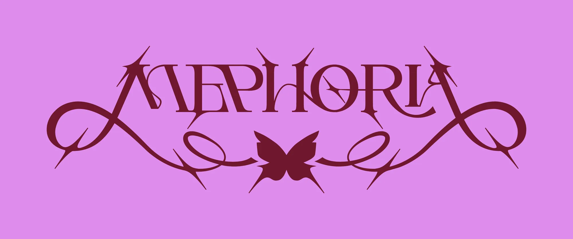 Wordmark and flourishCardiac Red on Paradise Pink
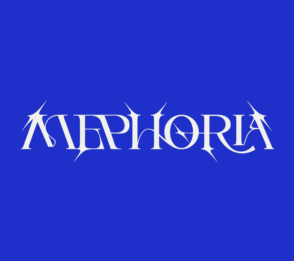 Primary lockupSerotonin on Lucid Blue
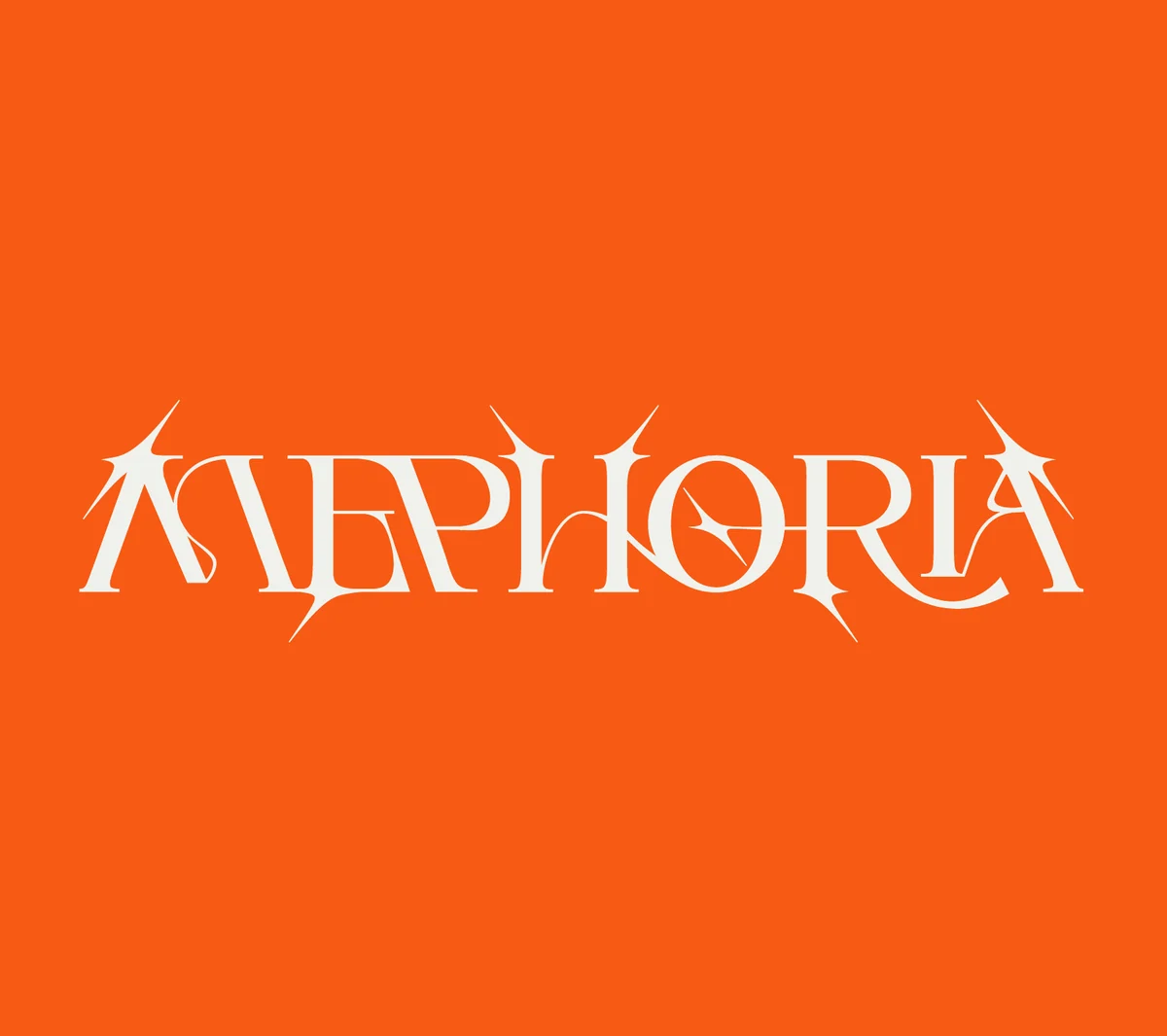 Primary lockupSerotonin on Ecstasy
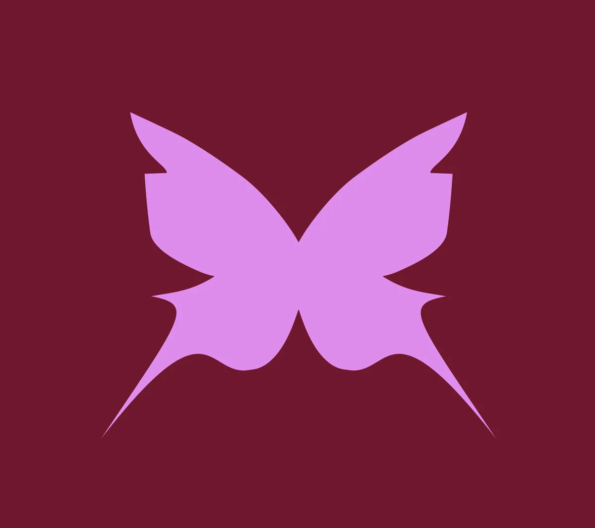 Butterfly submarkFavicon and social
 M monogramDopamine on Blue Daze
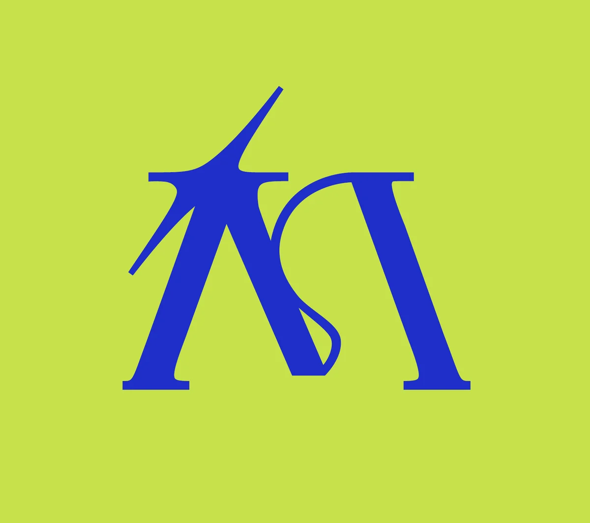 M monogramLucid Blue on Halcyon Yellow
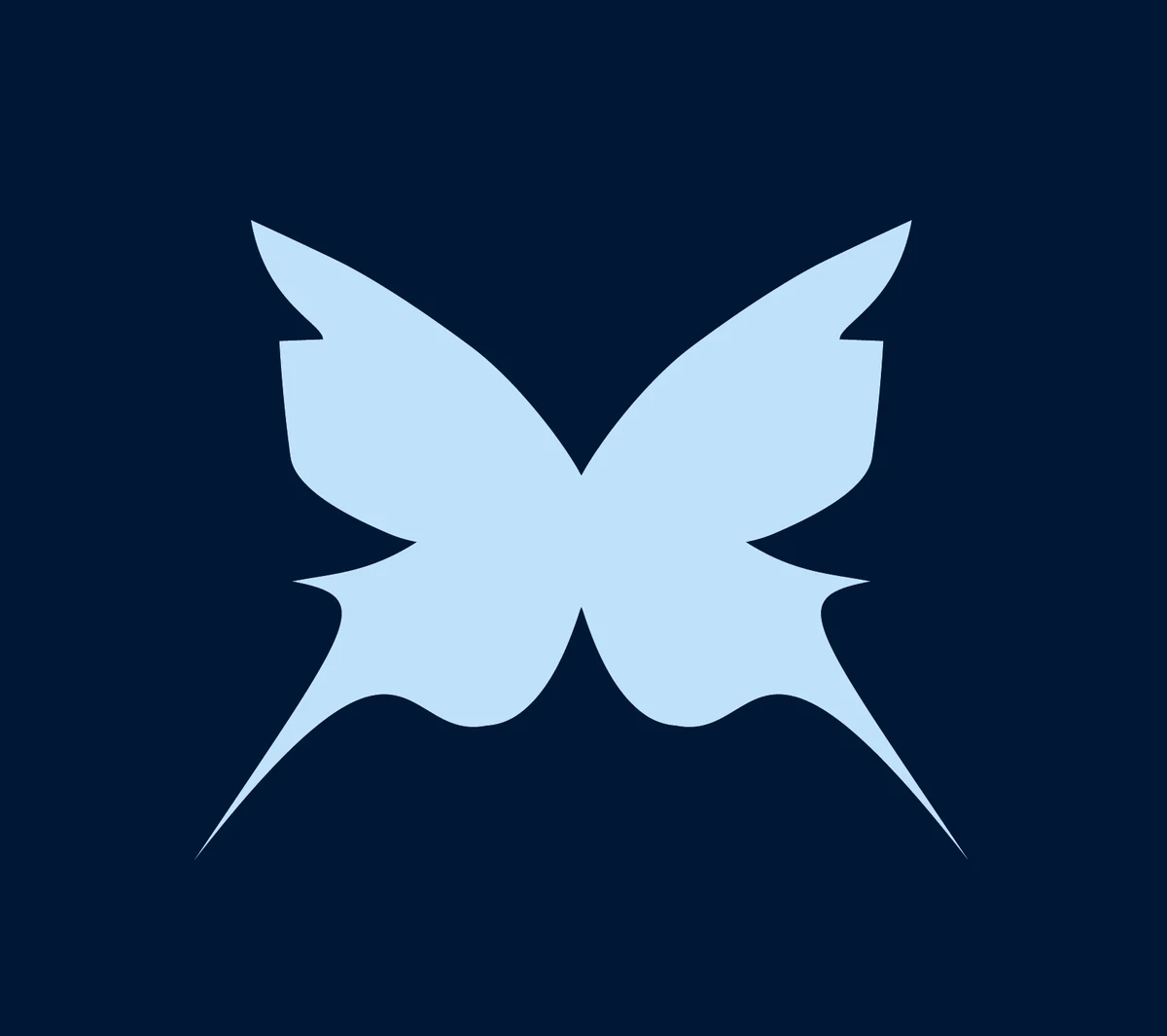 Butterfly submarkBlue Daze on Dopamine
A palette named for the feeling.
Happiness chemicals and euphoric states: the names tell the me + euphoria story in colour.
- Cardiac RedThe heartbeat: key messages and emphasis.
- Paradise PinkThe dominant field: the glow and the first impression.
- DopamineA deep midnight blue that anchors the type.
- Blue DazeCools and balances, and holds the reading text.
- SerotoninThe cream canvas under it all.
- EcstasyPunctuates a drop or a mood.
- Halcyon YellowOne or two at a time, never all at once.
- Lucid BlueThe ground of the primary lockup.
In proportion
- 55%Paradise Pink: the glow
- 30%Cardiac Red: the heartbeat
- 10%Blue Daze: the balance
- 5%Dopamine: the anchor
Lead with one pairing, expand with intent.
The serif expresses. The grotesque reads.
Ogg for the feeling, in headlines and product names; Cabinet Grotesk for everything that has to be read. One deliberate scale, about 1.333 from step to step.
Expressive mark, functional icons.
The logo is ornate; the icons do the opposite job: instantly legible, quietly out of the way. A clean line set for the shop, two pixels on a 24-pixel grid with round caps. The butterfly is the one filled mark.
 Search
 Bag
 Wishlist
 Account
 Necklace
 Earring
 Ring
 Gift
 Charm
 Butterfly
 Shipping
 Returns
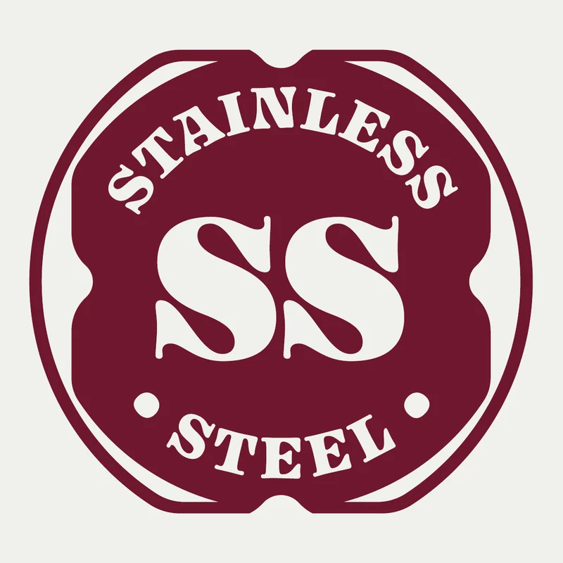
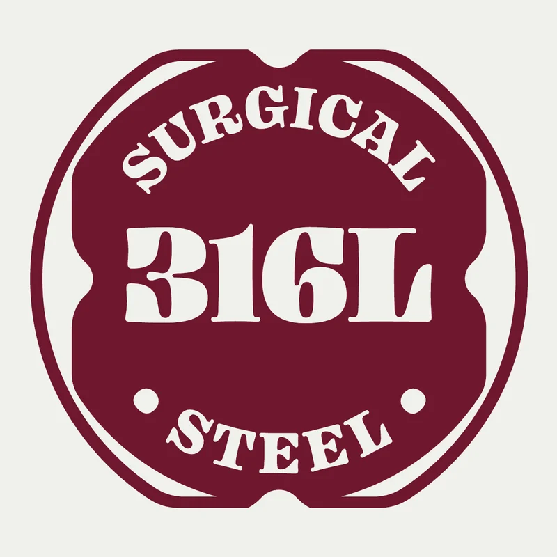
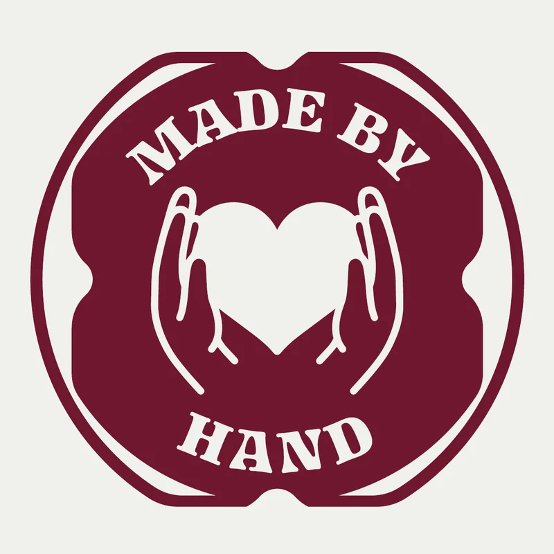
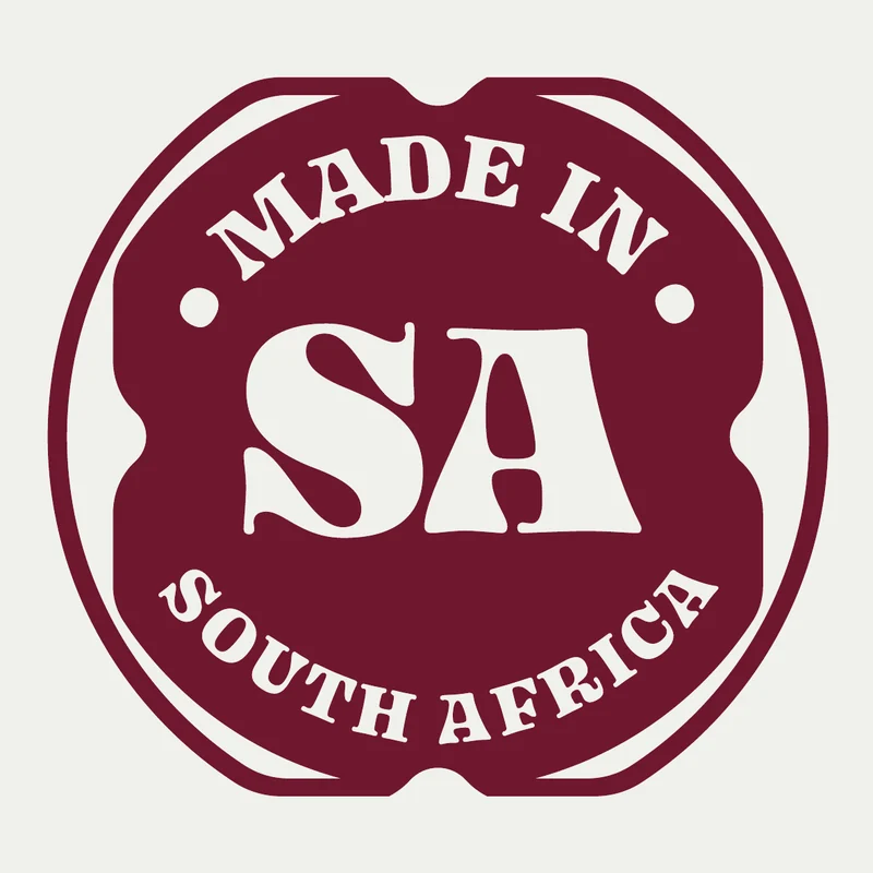
Stamped, scalloped, simple.
Eight badges for the shop and the packaging: what a piece is made of, and how and where it is made.
How Mephoria sounds.
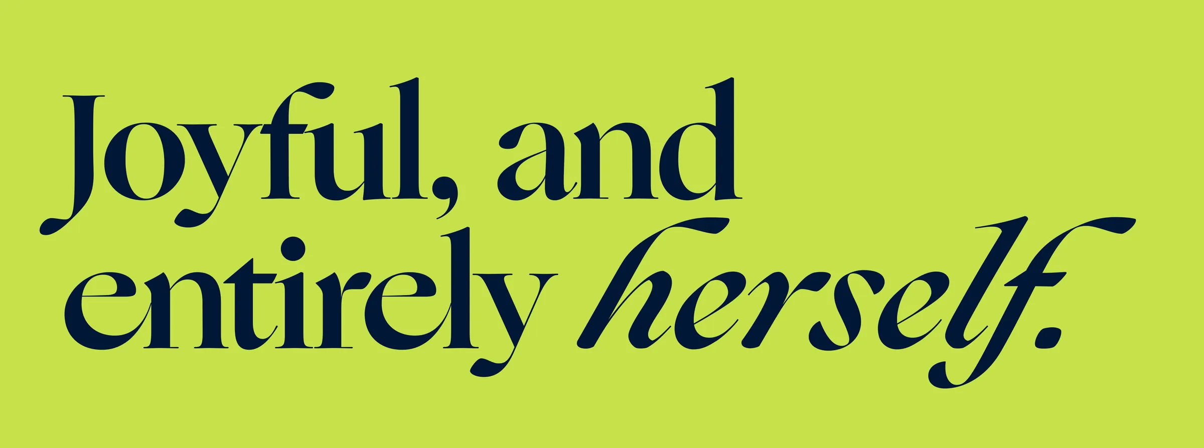
Warm, not stiff. Confident, never corporate.
- Joyful & warm
“Wear your euphoria. Every charm is a little hit of joy you pick for yourself — no occasion, no permission needed.”
- Confident, not loud
“Build the stack that feels like you, and wear it like you mean it. You don’t need a reason to treat yourself.”
- Personal & human
“Made by hand in South Africa, by someone who actually makes it. Real pieces, real stories — yours to build, one charm at a time.”
Sample lines from the brand book.
The identity,
out in the world.
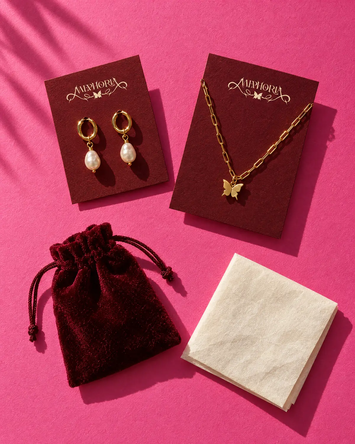
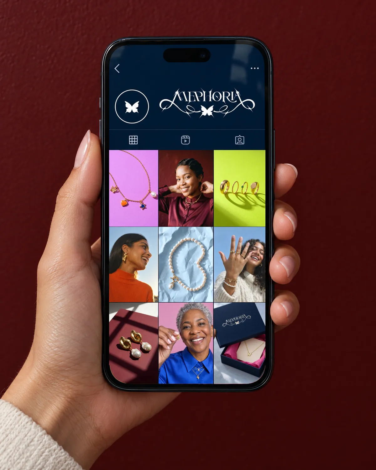
The box, the cards and the pouch, the feed and the bag: the system on the things a customer holds, visualised before anything is made.

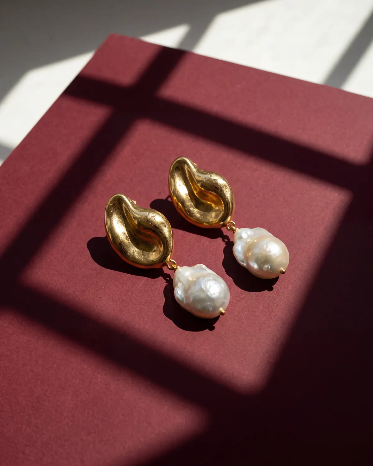
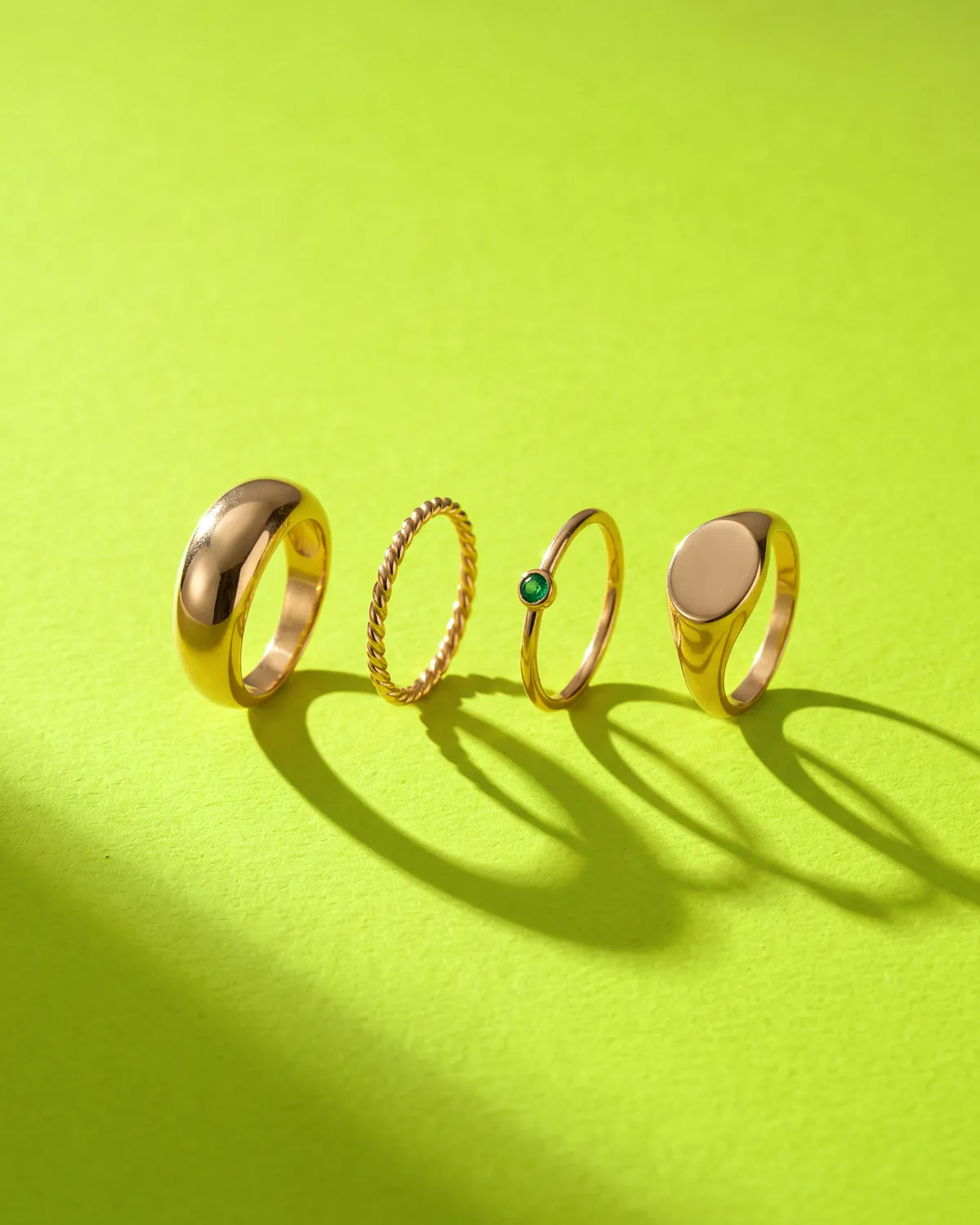
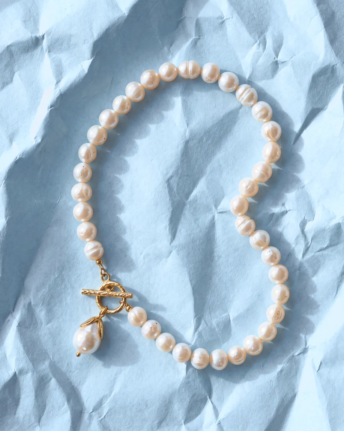
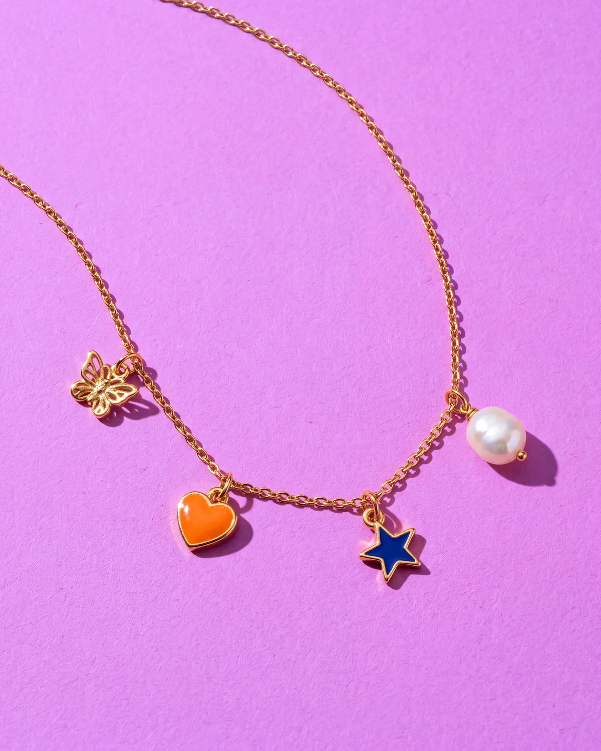
“Real gold,
honest light.”
The brand book’s product direction, generated here to brief the shoot: each piece on its own colour from the palette.
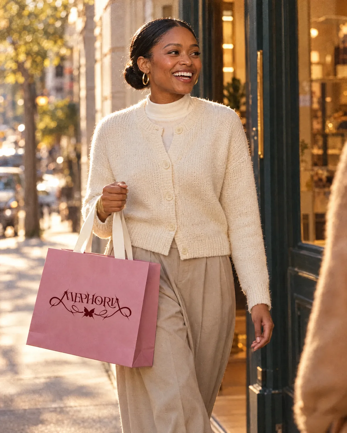
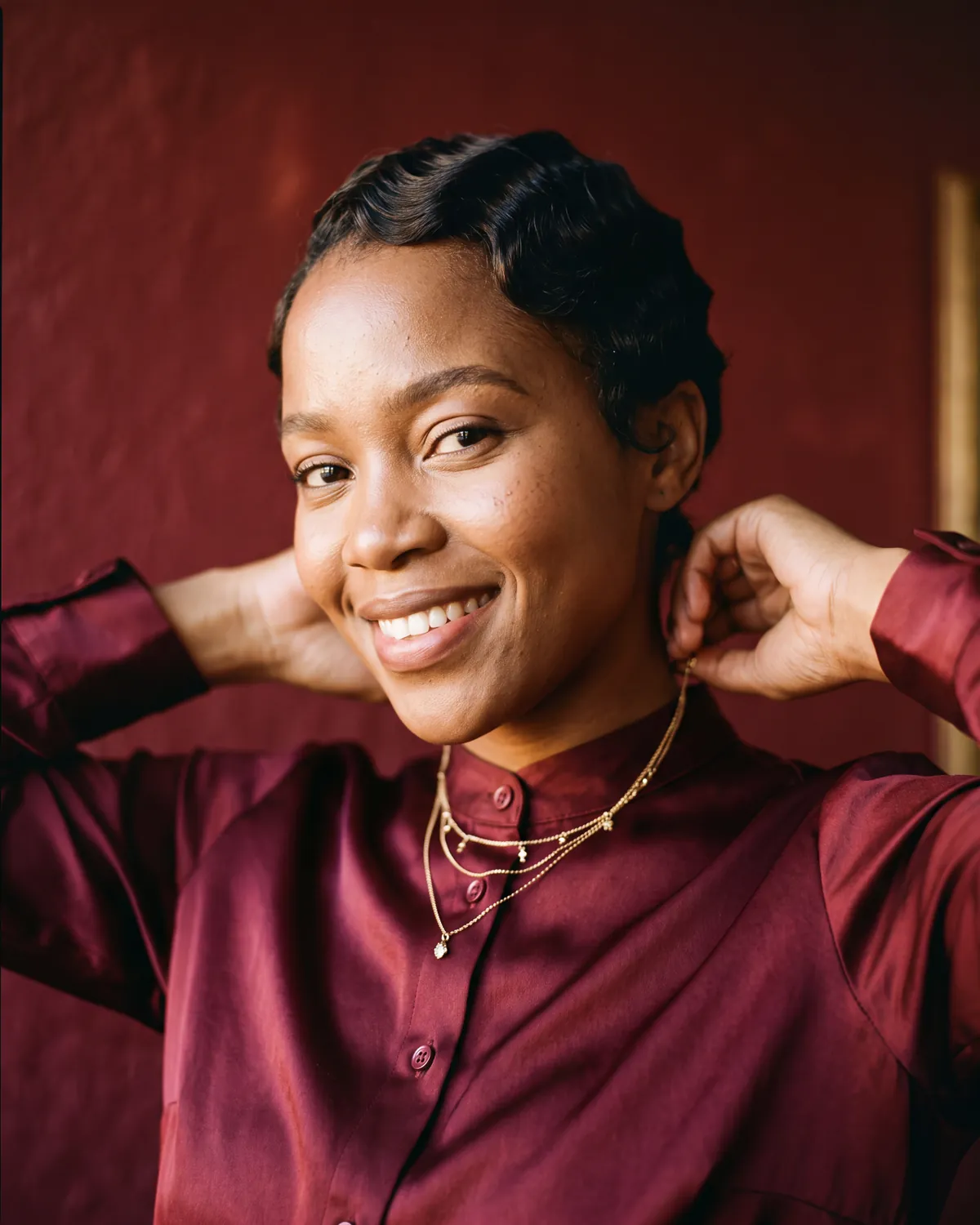
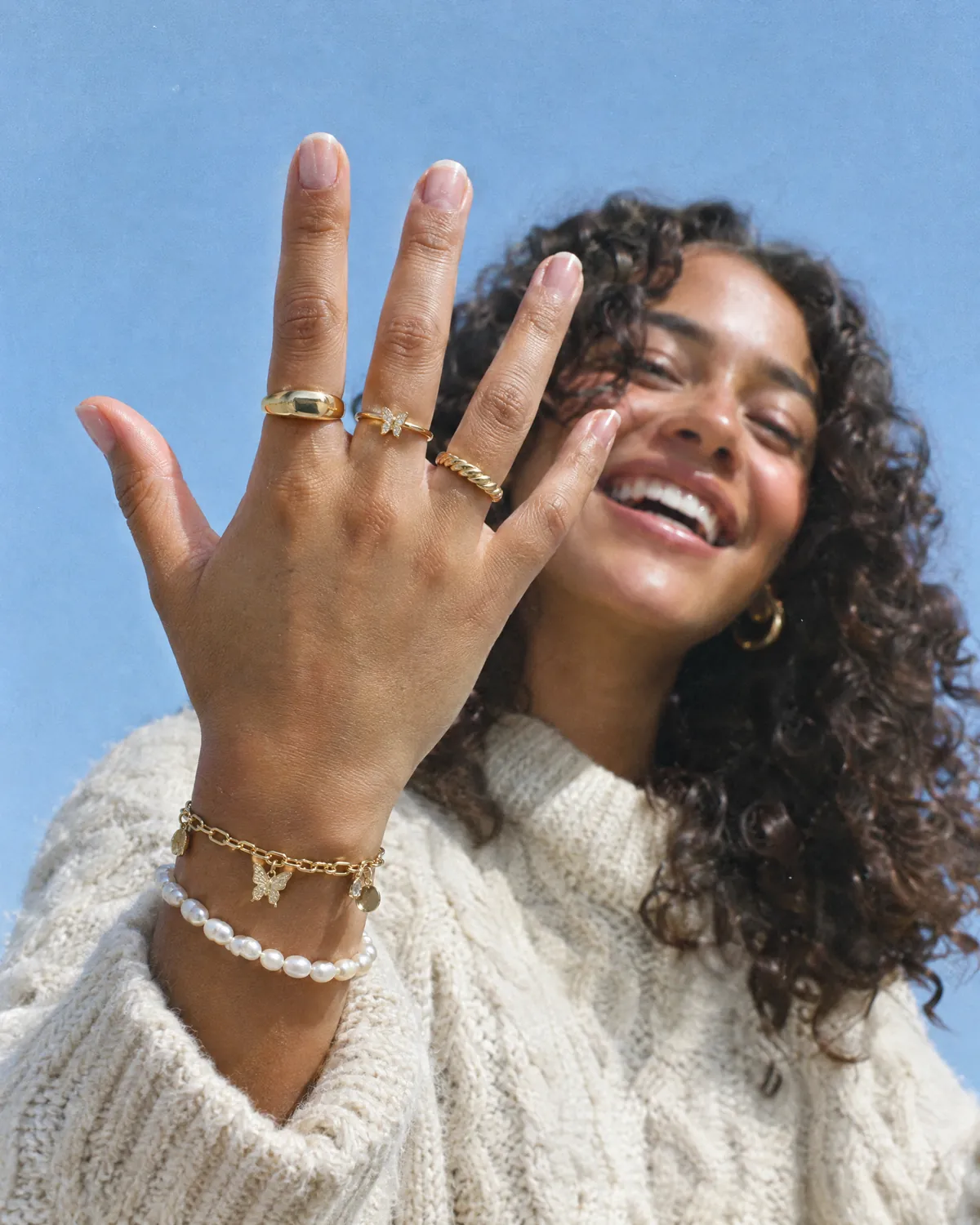
“Real people,
joy you can feel.”
The brand book’s lifestyle direction, generated here to brief the shoot: its moments, cast across many faces, every one of them warm.
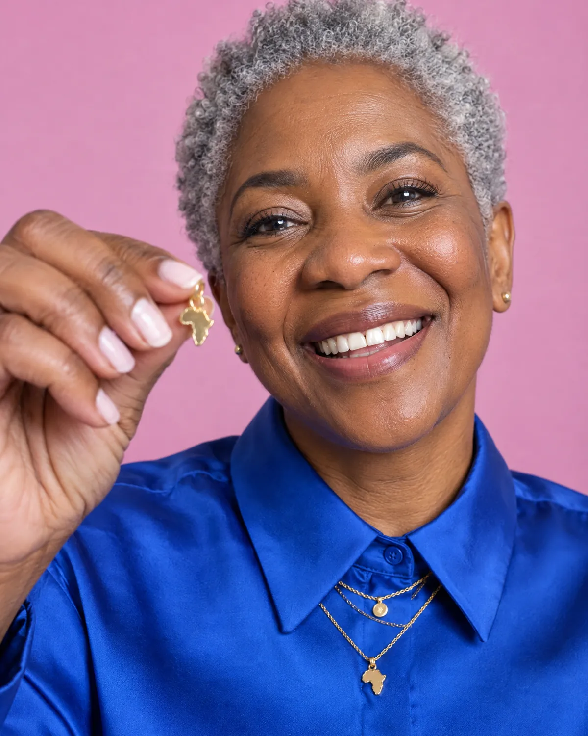
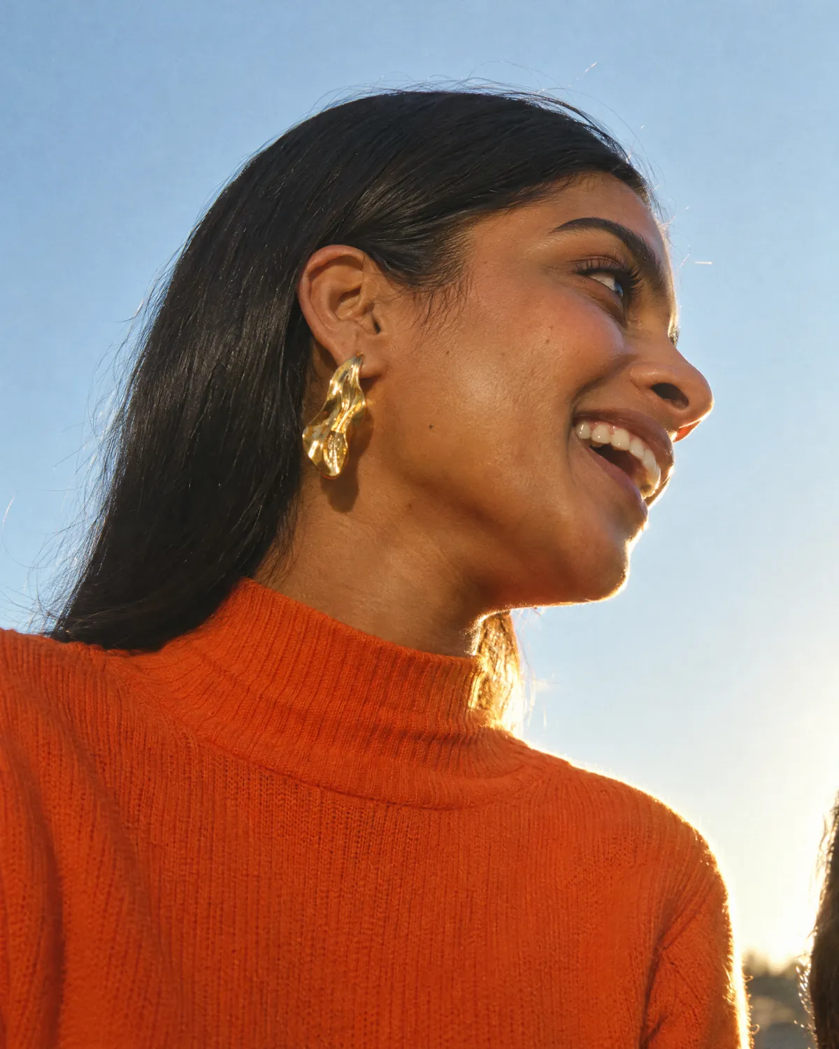
Cast for joy. Never for cool.
Generated frames set the look and the photographer’s brief; the real shoot, with real models and real pieces, ships the public face.
Do
- Genuine joy: a real smile or an easy laugh
- Emotion that reads: to camera, off-frame or lost in the moment
- Animated, relaxed, chin level
- Show personalisation: the personal meaning
- Cast for the muse energy across many faces
Don’t
- Vacant or checked-out: eyes closed, chin to the sky, slack mouth
- Floating with no spatial anchor
- Sultry, serious editorial coolness: beautiful but cold
- Bare shoulders or undressed, in AI-generated frames
- Unstyled, default or messy hair
Made by hand, in South Africa.
What went
into it.
- Wordmark & butterfly mark
- Logo family & colourways
- Colour & typography system
- Voice, muse & imagery direction
- Icons, badges & brand guidelines
Founded and handmade by Mari Du Plessis. Identity, wordmark and brand system by Phillip.
Pre-launch: the shop, the packaging and the photography are still to come. The brand-book pages, the icons and the logo artwork are the finished identity; the photographs are generated visualisations that show it in use and set the direction for the shoot.